My attempt at recreating the Steam trading card hover effect using HTML, CSS and Javascript (with jQuery)
Written by Tinos Psomadakis
https://interactive.tinos.xyz/steam-card03/04/2021
Introduction
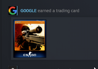
I recently found myself taking a peek at my friends' achievements under the activity feed shown below games in your Steam library. I saw that I had receieved a trading card for the game CSGO so I hovered over it to see if it would display any more information. Instead, I was pleasantly surprised to see this really cool 3D Trading card effect being used. I thought it would be a nice little challenge to see if I could recreate it.
Rotating the image
I'll be completely honest in saying that I may have spent upwards of an hour trying to find a way to rotate an image in such a way so that it appears with a rotation similar to that found on Steam.
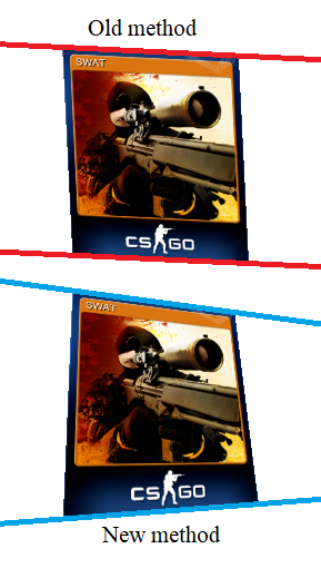
I quickly found out that I would need to use the transform: rotate3d() CSS property. However, I found that I could not get the edges to match up in the same way as the trading cards on Steam.
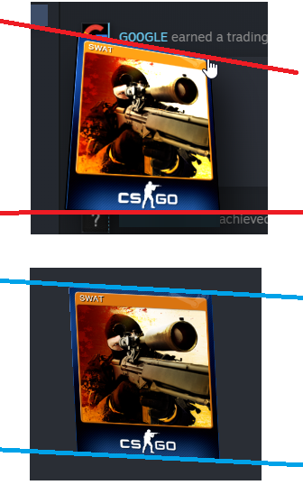
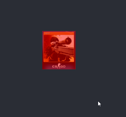
transform: scale(1.5) rotate3d(1,1,0,25deg);The difference between the two methods can be seen in the angle of the lines I drew on. If you look at the blue lines (vanilla rotate3d method), you notice that the two lines are parallel to each other. However, the two red lines clearly have different gradients. This had me really confused and at this point I started to lose faith in the project. As a last ditch attempt to save this project, I started reading the MDN (Mozilla Developer Network) documentation to see if it could help me out. As I was reading through the MDN article on rotate3d() I noticed that in one of the examples, they used a CSS property called perspective. This peaked my interest since through my knowledge of Blender, I thought that the issue could have something to do with orthographic vs perspective projection.
Perspective
With this new weapon in my aresnal, I started experimenting with values to see how they would affect the rotation. I started inputting perspective: 200px; and nothing happened.
I tried perspective: 1px; and nope, nothing changed. I was once again, confused with no leads to follow. Now I'm not going to lie here, I have no idea why I did this but I just had this idea in my head
to try append it to the transform property. One of the greatest feelings during programming is when you try something with barely any thought and it just works. And that is exactly what happened.
Initially, I tried transform: perspective(200px) scale(1.5) rotate3d(1,1,0,25deg); and almost poked my left eye out. After some adjustments I found the most accurate value to be in the range of 200px ±50px.
transform: perspective() and not using perspective at all.Cursor interaction
The first step to getting the cursor to interact with the image was to get the cursor to call a function when it was overlapping an image. I found this fantastic article and used it as a foundation for the rest of my code.
$(document).ready(function() {
        $('img').on("mousemove", function(e) {
            var offset = $(this).offset();
            var X = (e.pageX - offset.left);
            var Y = (e.pageY - offset.top);
            console.log{X, Y);
        });
    });
The code above will show the X and Y coordinates of the cursor in the relative dimensions of the image. The next step is to do some simple maths to calculate how to rotate the image.
The math behind the code
Cursor positioning
The rotate3d() documentation by the MDN states that the rotate3d() function takes in four inputs:
(x, y, z, a). Since we're only going to be rotating the image through the x and y dimensions, we can leave z as 0. For the angle (a), I decided to stick
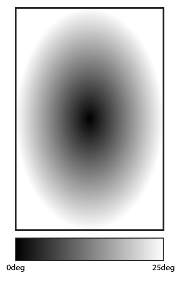
with 25deg for testing since it seems to be a very similar angle to the one used by Steam's trading cards. The next step is to try and calculate how much to rotate an image by in accordance to the the position of the mouse.
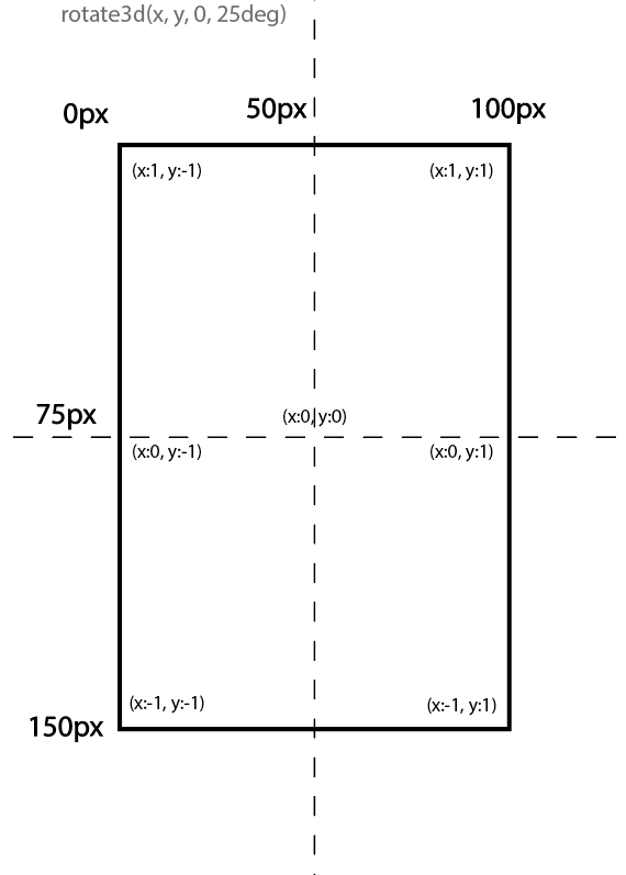
Now I need to convert the mouse location to the values shown. After some thinking, I realised that the best way of going about this would be to implement a cosine function into the image.
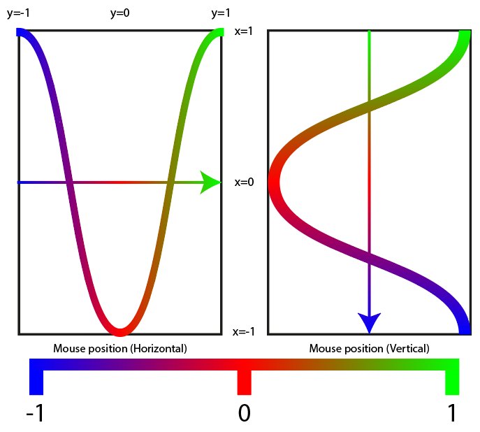
Green: 1, Red: 0, Blue: -1
Using the diagram, I came up with the following formulae to calculate the rotation vectors for the x and y coordinates:
\[-\cos({mouse\_position\_x \over image\_size\_x} * \pi )\]
\[\cos({mouse\_position\_y \over image\_size\_y} * \pi )\]
var xval = -(Math.cos((mx / imx) * Math.PI));
var yval = (Math.cos((my / imy) * Math.PI));
Lighting and Scale
You may notice some jittering in the example above. I will get to that later, however, I want to focus on getting smaller and simpler details such as the lighting effect and scaling sorted out first.
The lighting will be very easy to implement since it's a simple filter: brightness() that changes with the cursor vertical positioning. Here is the code snippet for calculating the luminosity:
var luminosity = 0.5 + (1 - (my / imy));
0.5 is the minimum brightness (when the cursor is at the bottom of the card). We add that value to the fraction of the image the cursor is from the bottom. Without the +0.5, the bottom of the card would return 0
while the top of the card would return 1. For the scale, I initially planned on having this as a css :hover selector however, after some testing I found that it would interfere with the cursor position
readings and would cause even more jittering. So instead of using static CSS, I implemented it using Javascript DOM instead so that it would affect the whole DIV instead of just the img tag. I also quickly added
the box-shadow property in the DOM since the Steam trading cards have a drop shadow. Here is the code for all of the DOM elements so far:
var transform = `perspective(200px) rotate3d(${yval}, ${xval}, 0, 25deg)`;

this.style.transform = transform;
this.style.boxShadow = "10px 10px 30px 0px rgba(0, 0, 0, 0.75)";
this.style.filter = `brightness(${luminosity})`;
this.parentElement.style.scale = "1.5";
Fixing and polishing
Fixing the jitter
After some investigation, I found the cause of the jitter to stem from the scale(1.5) DOM CSS property I had included. What was happening was that it was transitioning too slowly so that by
the time the scale was returning back to 1, the cursor was still overlapping and just causing this back-and-forth jittering. The method I used to fix this issue was to create a new div to act as a
trigger. I have coloured the trigger in a translucent red so that you can see what it is doing.
With this new method, if the user places their mouse cursor over an area that is within the card's "trigger" but not actually part of the card, it won't jitter any more but will instead stay rotated. I forgot to mention
that I also switched the DOM around a little. I made the transform, boxShadow and filter part of the image element and made the scale part of the parent card div.
Encountering a new problem
While working on fixing the jitter, I noticed a new bug where the rotation would get stuck when the cursor approaches the center of the card. This is because the rotation is a constant so even the tiny changes are being related to a rotation factor of 25deg. Once again, I have drawn a diagram to showcase the method I am thinking of using to fix this bug.
To implement this method, I came up with the following formula: $$rotation\_value = ({|x\_value| \over |y\_value|} / 2 ) * 25$$
var xval = -(Math.cos((mx / imx) * Math.PI));
var yval = (Math.cos((my / imy) * Math.PI));

var degval = ((Math.abs(xval) + Math.abs(yval)) / 2) * 25;
Final outcome
Note: quality heavily affected by gif compression.
Javascript Code
$(document).ready(function () {
    $('.trigger').on("mousemove", function (e) {
        var offset = $(this).offset();

        // Get mouse position relative to image
        var mx = (e.pageX - offset.left);
        var my = (e.pageY - offset.top);

        // Get image size
        var imx = parseInt(this.nextElementSibling.style.width.substring(0, this.nextElementSibling.style.width.length - 1)) * 1.5;
        var imy = parseInt(this.nextElementSibling.style.height.substring(0, this.nextElementSibling.style.width.length - 1)) * 1.5;

        // Calculate value 0 -> 1 for X and Y positions of mouse.
        var xval = -(Math.cos((mx / imx) * Math.PI));
        var yval = (Math.cos((my / imy) * Math.PI));

        // Calculate change in degrees with cursor position
        var degval = ((Math.abs(xval) + Math.abs(yval)) / 2) * 25;

        // Calculate luminsoity value for brightness depending on cursor position
        var luminosity = 0.5 + (1 - (my / imy));

        // set DOM changes to style
        var transform = `perspective(200px) rotate3d(${yval}, ${xval}, 0, ${degval}deg)`;
        this.nextElementSibling.style.transform = transform;

        this.nextElementSibling.style.filter = `brightness(${luminosity})`;
        this.parentElement.style.scale = "1.5";
        this.nextElementSibling.style.boxShadow = "10px 10px 30px 0px rgba(0, 0, 0, 0.75)";

    });
});

// Function to reset all DOM changes
function mouseout(e) {
    e.style.transform = "";
    e.parentElement.style.scale = "1";
    e.nextElementSibling.style.filter = `brightness(1)`;
    e.nextElementSibling.style.boxShadow = "0px 0px 0px 0px rgba(0, 0, 0, 0)";
    e.nextElementSibling.style.transform = "none";

}
HTML Code
<!DOCTYPE HTML>
<html>

<head>
  <meta charset="utf-8">
  <link rel="stylesheet" type="text/css" href="styles.css" media="screen">
  <meta name="viewport" content="width=device-width, initial-scale=1">
  <script src="https://ajax.googleapis.com/ajax/libs/jquery/1.11.3/jquery.min.js"></script>
</head>

<body>
  <div class="container">
    <div id="card" style="transition: 0.5s;" class="trading-card">
      <div class="trigger" style="width: 111px; height: 129px;" onmouseout="mouseout(this);"></div>
      <img id="SWAT" src="card.png" style="width: 111px; height: 129px;">
    </div>
  </div>
  <script src="main.js" type="text/javascript"></script>
</body>

</html>
CSS Code
body {
    margin: 0;
    padding: 0;
    background-color: #2a2e35;
}

.container {
    position: absolute;
    left: 50%;
    top: 50%;
    transform: translate(-50%, -50%);
}

.trading-card:hover {
    cursor: pointer;
}

.trigger {
    position: absolute;
    z-index: 2;
}